Bekkenbodemhuis
brand identity for a pelvic floor physiotherapy clinic.
2026
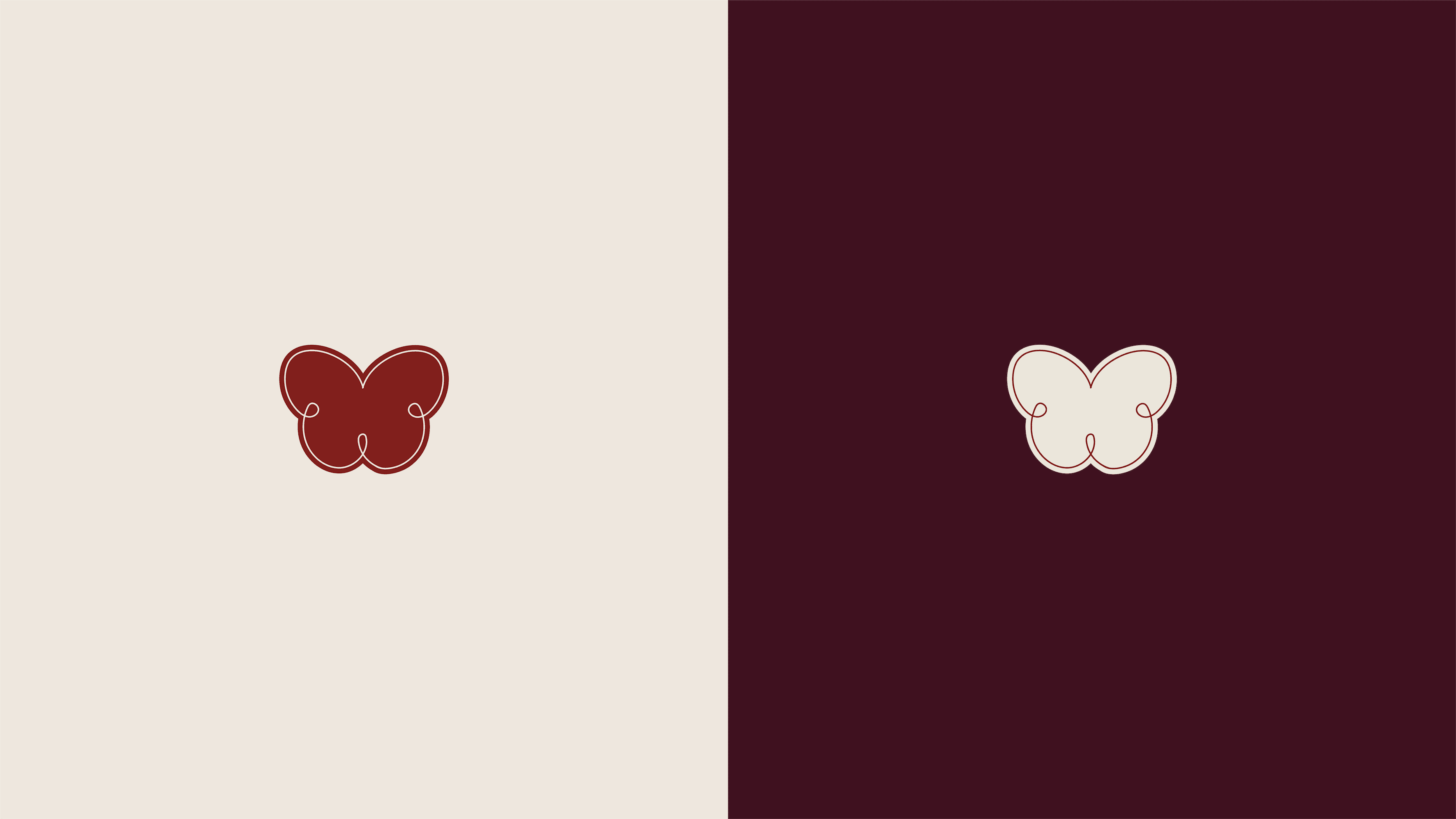


bekkenbodemhuis is a pelvic floor therapy practice, and most patients arrive after putting
the appointment off for months. the identity had to make that first visit easier:
warm, recognisable, and nothing like a hospital. i built it around an eight tone palette
instead of the usual three. bordeaux, crimson, terracotta, blush and rosewood carry
the warmth. slate, steel blue and ivory hold it steady. the deep tones front the practice,
the soft ones sit behind the treatment information, so the palette does most
of the reassuring before a patient has read a single word.